Using Data Visualization to Help Users Understand Cyber Threats
Cybersecurity systems generate overwhelming volumes of complex data, often buried in technical logs, alerts, and jargon—making it difficult for users to quickly identify threats, make decisions, and respond effectively At Radware, we follow best practices that focus on transforming this complexity into clarity through intuitive, purpose-driven data visualization. In this blog, I’ll share how we in Radware apply these practices across our products to surface insights, enhance decision-making, and turn raw data into actionable understanding.
Key Principles of Effective Cybersecurity Data Visualization
- Prioritize Clarity Over Complexity Cyber threats require swift responses. Visualizations should present clear, concise data rather than intricate graphics that complicate decision-making.
- Context is Crucial Presenting data without context can lead to misunderstandings. Clearly labeling visual elements and providing contextual explanations or tooltips will help users grasp the significance of data.
- Real-Time Updates. Simple, coherent visualizations - such as dynamic timelines, live-updating graphs, or real-time status dashboards - will enhance effectiveness by providing users with immediate insights, enabling faster and more accurate responses.
- Use Familiar Visual Metaphors Users interpret familiar visual metaphors more quickly. For example, using color-coded threat levels: green for safety, red for danger, or common symbols can significantly accelerate comprehension.
How We Empower Users with Effective Visualization
-
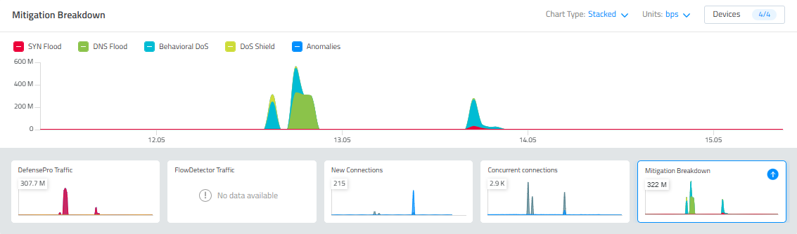
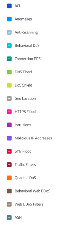
Color Coding: In Cyber Controller we used distinct and meaningful colors to quickly differentiate threat levels or data categories, improving immediate understanding. In some graphs, such as mitigation breakdown – in the example below, we chose specific colors that remain fixed over time, making it easier for users to match colors consistently to specific attack types.
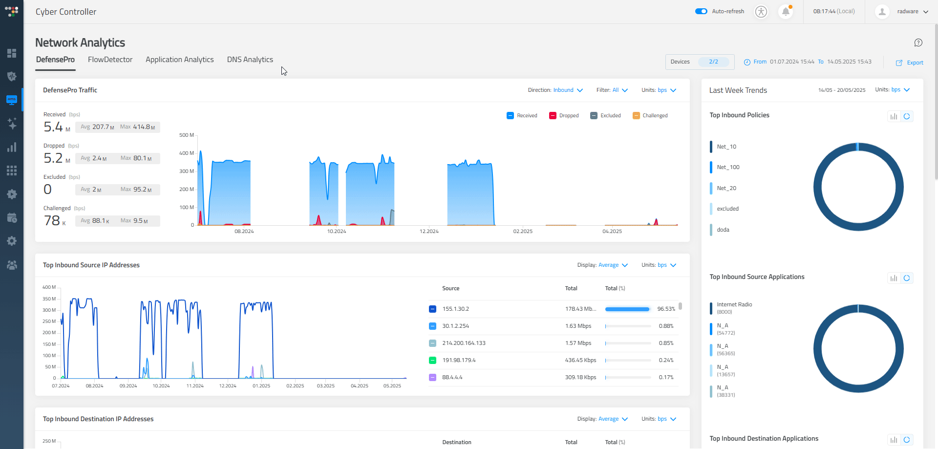
- Customizable Graphs: We provided users with various graph types, including bar charts, line graphs, and pie charts, enabling them to customize their visualizations according to personal preferences and specific analytical needs. In Radware’s "Network Analytics", we specifically implemented the option for users to switch seamlessly between pie and bar charts to enhance their analysis process.
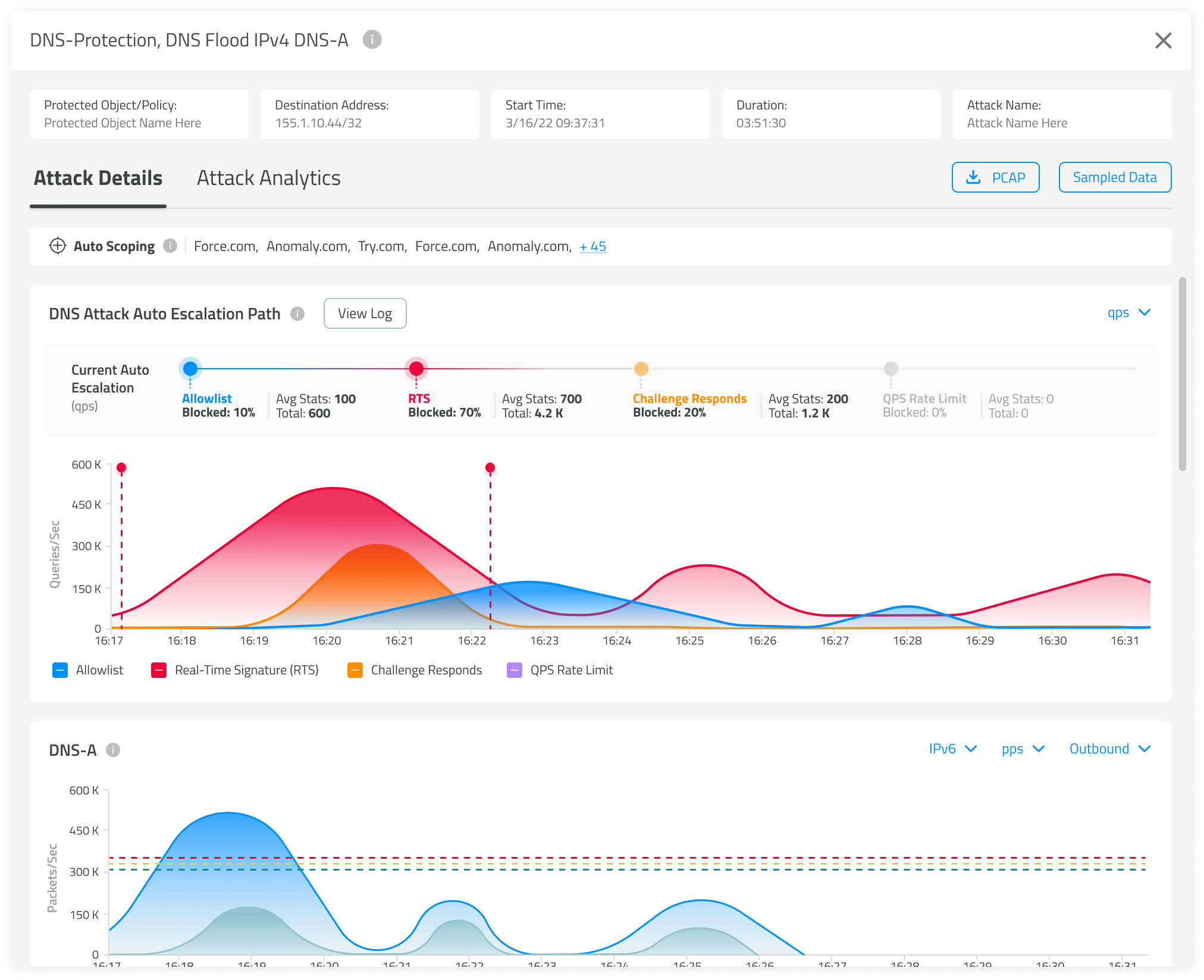
- Timeline Views: Clearly depict the sequence and timing of events, crucial for incident analysis and response planning. For DNS Attacks, we developed a special escalation timeline that allows users to see in real time what type of protection is active and the order in which protections are engaged.
- Dedicated Dashboards: Offer specialized dashboards tailored to specific roles or tasks, allowing users to access relevant information efficiently and without distraction. In "Network Analytics," each tab functions as an entirely separate dashboard dedicated to specific analytical areas, including DefensePro, FlowDetector, Application Analytics, and DNS Analytics.
- Anomaly Indicators: We use visual markers like flags or pulse animations to highlight anomalies in behavior or traffic patterns, helping users spot suspicious activity at a glance.
- Trend Charts: We present threat trends over time that will help users observe long-term changes, seasonal patterns, or recurring attack spikes.
Real-World Impact
In my experience, employing these visualization techniques has led to noticeable improvements:
- Faster Response Times: Users identify and address threats significantly quicker, reducing potential damage.
- Increased User Confidence: Intuitive visualizations make users feel more in control and confident in their decision-making processes.
Conclusion
Effective data visualization is not merely about aesthetics - it’s a strategic tool that simplifies complexity, supports rapid decision-making, and ultimately helps protect organizations more efficiently. By emphasizing clarity, context, real-time insights, and intuitive design. I strive, as a product designer, to significantly improve the effectiveness of our cybersecurity solutions.
If you're looking for a broader industry perspective, I also recommend reading The Significant Role of Data Visualization in Cybersecurity, which explores the strategic importance of visualization in cybersecurity. This post focused on the practical design decisions we’ve made to bring that vision to life.