There are a handful of assumptions that frequently come up when we read and talk about mobile performance. Today, I want to review the most common myths, discuss why they persist, and explain why they are incorrect.
Myth #1: People expect pages to be slower on mobile devices than on desktop computers.
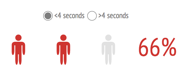
Not only is this untrue, but in fact the opposite is the case. Two out of three smartphone users say they expect pages to load in 4 seconds or less, and 85% expect pages to load as fast or faster than they load on the desktop.

What people say they want doesn't always correlate to what they actually want, so here at Radware, we backed up these survey claims with some research. Last fall, we commissioned an independent study in which we monitored the brain activity of participants as they performed shopping-related tasks on mobile devices. We found that introducing a mere 500-millisecond network delay resulted in increases of up to 26% in user frustration. We also found that page slowdowns negatively affected people's long-term impression of the entire brand - from the usefulness of the site's content to the trustworthiness of the company itself.
Myth #2: An m.site is a cure-all for performance problems.
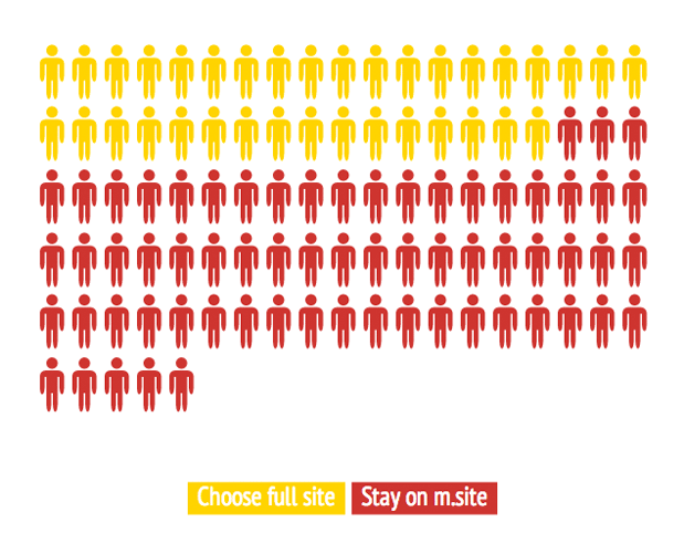
M.sites - alternative websites with their own domains, which serve a stripped-down version of pages to mobile devices - are not an effective strategy for many site owners. Most m.sites aren’t up to the challenge of serving the rich, dynamic experience, not to mention the depth and breadth of content, that most users expect. And according to research we conducted in 2012, 35% of mobile users will choose to view the full site when given the option.

Mobile users who shop via the full site are also better customers than those who shop via the m.site. We found that, for every $7.00 of mobile-generated revenue, $5.50 (79%) was generated by mobile shoppers using the full site. Only $1.00 (14%) came via m.site, and $0.50 (7%) via the mobile app.

Myth #3: Responsive web design will automatically make pages faster.
Responsive web design has been hailed as the solution to delivering a single website to multiple platforms. But as with any tech bandwagon, there are caveats. Responsive websites are complex, and that complexity can come with a hefty performance price tag. This is not to say that building a fast responsive site can’t be done — just that site owners need to be aware that RWD may make your pages look better on a variety of devices, but it doesn’t automatically make your pages load better on a variety of devices.
One of the perils of RWD retrofitting has been compared to trying to pour 10 gallons of water in a 3-gallon bucket. In a recent survey of 60 responsively designed web sites, I encountered many pages that exceeded 3, 4, and even 5MB in size - resulting in significant performance hits. Of the 12 fastest pages I looked at, all were under 1MB in size.
Takeaway: Building a high-performance responsive site is a ground-up endeavor, and site owners need to design with mobile performance in mind.
Myth #4: Mobile latency and desktop latency are identical.
In web performance circles, “latency” is the amount of time it takes for the host server to receive and process a request for a page object. The amount of latency depends largely on how far away the user is from the server. On a typical U.S. desktop using wifi, the average round trip time (RTT) for an individual resource request is 50 milliseconds. On a mobile network, the average RTT is more than 300 milliseconds. To put this number in perspective, this is roughly comparable to a 1990s-era dial-up connection (remember those?).

Bearing in mind that a typical web page contains 100 resource requests, it's easy to see how latency adds up, even with many resources loading concurrently. This is why Google performance expert Ilya Grigorik has stated that if you’re designing for mobile, it’s safe to assume your pages will incur a total of 2000 milliseconds of 3G latency.
Myth #5: Your CDN will deliver the same acceleration benefits to your mobile visitors as it does to your desktop visitors.
Content delivery networks are somewhat effective for mobile users, but it may be hard to rationalize the cost based on the marginal return. A while back, I wrote about a case study in which we stepped through a series of acceleration treatments on a page to measure the impact of each treatment for mobile users. When we added a CDN, we found that:
- Doc complete time decreased by only 10%, compared to a 20% improvement we noted in a similar experiment in desktop optimization.
- We shaved less than a second off start render time, taking it from 7.059 seconds down to 6.245 seconds.
Conclusion: While there were performance gains, they were not hugely significant. This could be attributed to the huge variability in network latency, as discussed in myth #4, above.
Myth #6: 4G/LTE is a cure-all for mobile performance pains.
In 2012, we performed real-world performance testing of 200 leading ecommerce sites over 3G and LTE, and found that LTE was only 27% faster than 3G. This is a far cry from claims that LTE is, on average, 10 times faster. And even if LTE were significantly faster, 3G isn’t going away any time soon. Count on it to be around until the ’20s. Consider it the cellular network version of Internet Explorer 6.
Myth #7: Performance optimization techniques work the same for desktop and mobile users.
While many of the front-end web performance optimization (WPO) techniques that make pages render faster on desktop also work for mobile devices, the two platforms require different approaches in some instances. Some examples:
- Leveraging the browser cache - Leveraging the desktop cache to store page resources (such as images and CSS files) is a core performance best practice that allows pages to load faster throughout a user’s path through your site and on repeat views. Mobile browser caches, however, are usually much smaller than desktop, causing items to be flushed quickly — sometimes even within a couple of page clicks during the same visit. It’s possible to leverage the newish HTML localStorage specification as an alternative to relying on browser caching, but this isn’t a default. It has to be done manually or via an automated solution such as Radware’s FastView.
- Inlining - From a performance standpoint, if a resource isn't likely to have been cached already, it is often best to embed that resource in the page's HTML (called inlining) rather than storing it externally and linking to it. The disadvantage of inlining is that page size can become very large. This isn't a problem for desktop users, but it presents an obvious problem for mobile users, especially those who must be mindful of their data cap. It's crucial for web sites that use this technique to track when the resource is needed and when it is already cached on the client. The application must also generate code to store the resource on the client after sending it inline the first time. This is another reason why using HTML5 localStorage on mobile devices is a great companion to inlining.
- Image resizing - Images often consume the majority of the network resources required to load web pages, and the majority of the space required to cache page resources. Mobile devices present opportunities for speeding transmission and rendering by resizing images. To speed up page rendering and reduce bandwidth and memory consumption on mobile devices, images can either be dynamically resized or replaced with smaller versions for mobile sites.
- Auto-preloading- Especially with mobile networks that may charge extra for using more bandwidth, certain techniques should be used only when combined with code to detect the type of connection. For example, preloading resources in anticipation of future requests is usually smart, but it may not be a responsible strategy if the user's bandwidth is metered and some of those resources may never be needed.
There are more, but this gives an idea of why performance optimization for mobile is not identical to optimizing for desktop. You can learn more in these white papers, which explain how our FastView solution works for desktop and mobile devices.
Conclusions
With more than half of all time spent on retail sites taking place on mobile devices, it has never been more important for site owners to give equal attention to how their web sites and web-based application perform for both mobile and desktop visitors. Yet there are a number of incorrect assumptions that can stand in the way of creating an effective mobile-first strategy. To develop an online strategy that puts users first, it is crucial to understand how people actually think about and use mobile devices, as well as how mobile and desktop platforms are alike and how they differ.
Like this article? Receive similar articles by subscribing to our blog today!